Each month USDA publishes the WASDE report which gives projections about commodities demand and supply.
All the commodities traders have their own “robot software” to check as soon as published the trend of USDA report. One of the major data watched is the “stock to use ratio” which is the projected end of year stock versus the total domestic consumption. Logically, according to the supply and demand relationship, there should exist a strong inverse correlation between stock to use and price which is the basic principle of fundamental analysis.
I wrote a code to analyse the WASDE reports (text file or excel files, depending of the period) to export the projected data for wheat and compared these data to the monthly wheat price. The objective was to note if the WASDE projections would have some effects on the prices. This code is written with R software to parse efficiently text files and excel files for long period. The interested reader could check on the Excel macro written by Vincent Jeannin
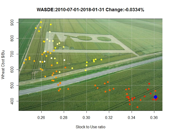
This simple graph help the user to see the actual financial trend for the wheat comodity (Entire world). In the title the change from the last month in stock to use ratio is given, of course, the more it is negative, the more the price could rise. The blue dot indicate the last data (12 Jan 2018).
The points color is a time indicator from yellow (older points to 2010) to red points (recent points 2018), the last point is from the last report (jan2018)
There is a relationship between the two data, (R2=0.65), but this relationsip can change according to the financial and economic context. Nethertheless, the direction given each month by the WASDE report (very neutral this month) may help in financial decisions.
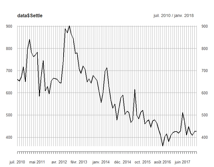
As shown on the following graph, the context is not favourable for the farmers prices.